Unfortunately I don’t have backup. First, everything is too big, second I really miss “things” on dashboard. Also I would love to see ability to customize views and dashboard.
Awesome new app guys. Even the wife agreed. We both also agree the picture is a waste of space. Maybe cut it down to 1/3 the height. Under lights&switches… what on earth! The icons are huge. Make them half the size and displace 8 icons instead.
We are going ot work iteratively in the coming weeks and months to tighten the experience. Some of what we have planned was pulled out of scope for this release but will address some of the concerns I am reading here.
Specifically on the picture issue, the iOS app starts like that but then as you scroll the image gets smaller. I think we are working towards that convention in Android. Like this:
The new APP is awesome!! Congrats ST Team
Just a few things to ask about the 2.0 version for Android:
The “things” screen picture takes up too much real estate. I can only see maybe 3 or 4 things and half the phone is your picture, is there any way to make it so the picture minimizes to the top?
Your “Groupings” or “Rooms” area where you can now see your groups… when creating a new “area” it only allows you to either “Take a picture” or “Use one from the Gallery.” How easy would it be to allow the built in “generic” icons to be used that come with the program? Such as, a group of Cree lightbulbs, I have to “take a picture” of a Cree light bulb just so I can have an icon for the group, or my grouping of WEMO switches. Your program has these pictures in the database when you are locating them, it would be nice if we could use canned pictures for our “groups” and “things”
Lesser observation… I wish there was an easier way to “remove” mistakes when making “smart apps” I made a few (before I learned how to edit the existing ones I had to add more lights to the original app) and can’t seem to easily remove them. I wish to have an easy method of trashing a smart app that I created that I no longer need.
I haven’t seen this anywhere and forgive me if I’ve missed it but is there an update on administrator/user hierarchy for the new app or Hub V2? I don’t want everyone to have access to my account and all of the controls. More like limited to lights and locks or just presence.
In rooms, I am missing icons to the left and right of the room. Things has icons. That normal?
Also, in general, is there a place to submit feature requests in an ordered way. Like Ideascale?
Not at this time. User permissions are the same as they were before. There is the new contact book feature that will allow you to send notifications to a select set of recipients, but if they can log into the app, they can see and do everything.
Now that I’ve had time to get used to it and explore the UI, I actually prefer the new app. It’s given me the opportunity to eliminate and consolidate many discrete smartapps I had previously used to accomplish the same functionality. Developers should take a bow.
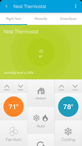
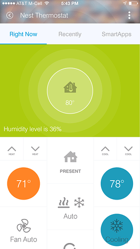
However (you knew that was coming)… please give priority to unifying the app rendering between Android and iOS (attn: @April, @kris). Compare the screenshots below of my Nest thermostat custom smartapp, taken simultaneously. The first image is how it appears on my Nexus 5; the second, as it appears on my wife’s iPhone 6. Notice the top of screen difference (Android shows that horrid Holo Blue, while iOS shows my “house” image…though the blurred house image does appear elsewhere in the Android UI). Also notice the reverse rendering of the multiAttributeTile, that Android shows the device name twice, how Android ignores the color attribute on the state (Cooling) tile, and that the text on the state tile does not scale in iOS. iOS always seems to render the white ring around the multiAttributeTile; with Android it’s hit or miss… even when using ST device types. And speaking of the multiAttributeTile, how is this image even possible? It’s clearly an Android phone, yet shows the multiAttributeTile with the iOS rendering (white ring with light center, radiating out to a darker gradient. Marketing department Photoshop? 

