Thanks - no apologies needed. Bugs are bugs. A Post-it® brand note will suffice. 
I have to open a ticket if I want to blow my noise.
The change management systems have become so convoluted at large companies, that 80% of an employees time is paperwork asking if they can do the job they were hired for.
I still abide by the ask forgiveness not permission policy.
2 Likes
Love this change!
I’ve read the suggestion for Arm, Disarm, Arm(Stay) to be displayed which would be ok but I prefer the Mode because it tells me the same Home=Disarm, Away=Arm, Stay=Arm(Stay) but with added ability to see my other custom modes.
What I don’t love so much is losing the status of the SmartThings MODE directly from the MyHome Things menu where it use to be always visible. Clicking on the hamburger menu to see it makes it another tap deeper.
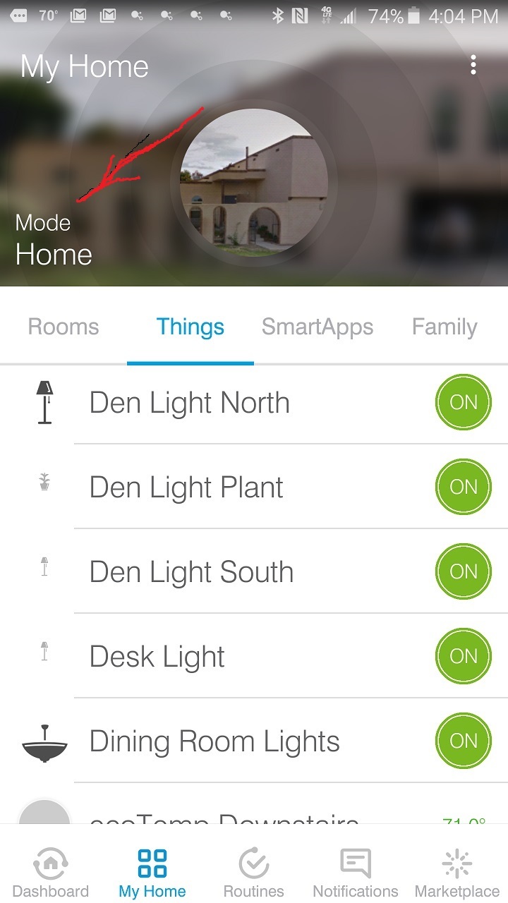
That assumes the SHM mode shifted with the presence sensing mode. That’s often not the case for me. I get ‘Away’ but the system doesn’t arm. I’d like to have both items display so I know what’s not right.
Same as having a working dashboard. It’s about one-glance-and-I-know.
I am not referring to the SHM modes but the global SmartThings modes (not sure if I am describing that in the correct terminology). I don’t use SHM at all. I only use SmartAlarm. I use to think that those modes were the same because of the exact wording of each but they are different animals from what I understand. @JDRoberts posted something about this but I couldn’t locate it to reference here.
Here you go:
@chrisb had an excellent detailed explanation here:
Just as an example, many people will have SHM set to “armed stay” while the global mode changes from "home " to “night” based on time of day. They are two independent variables.
1 Like
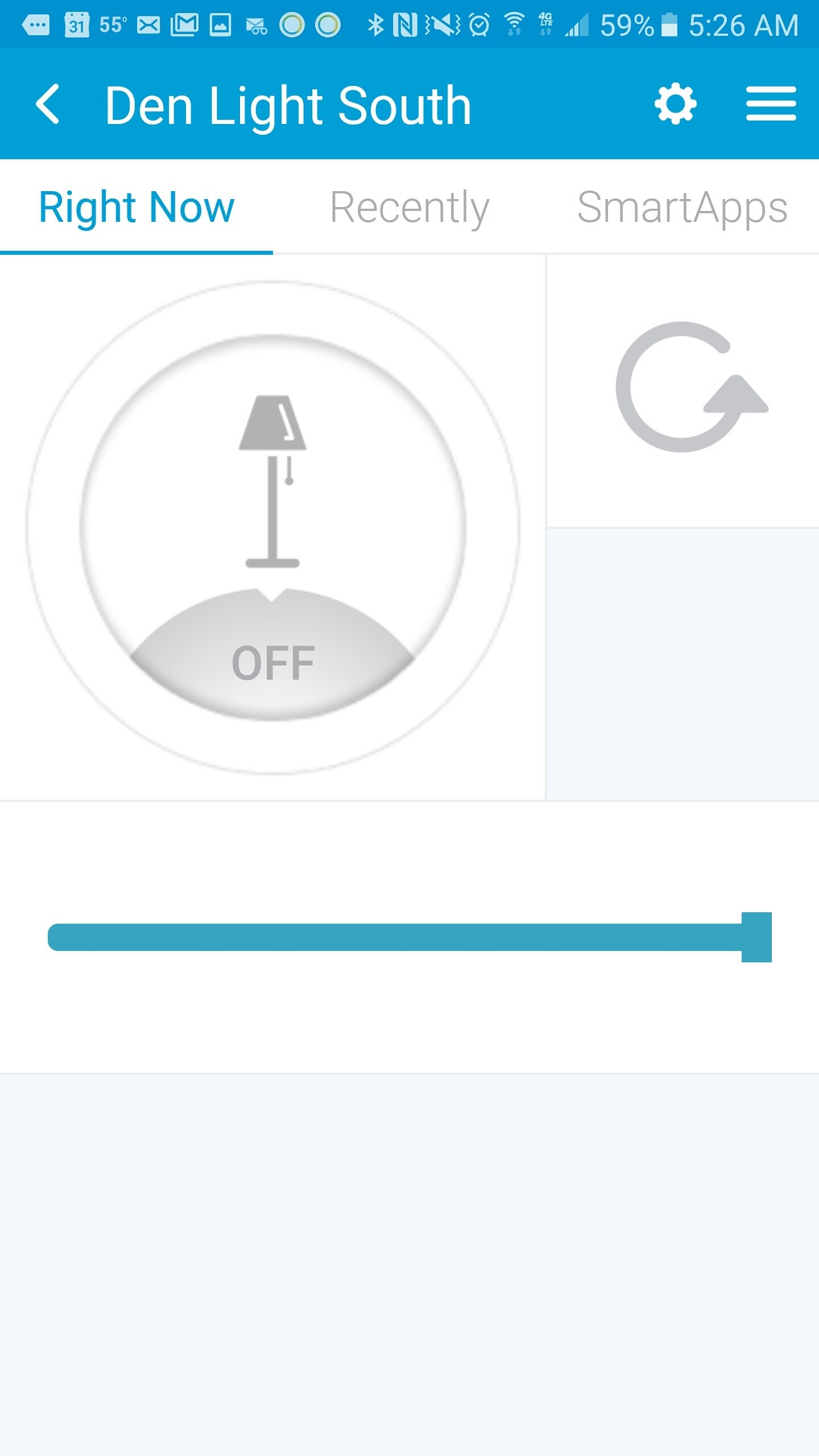
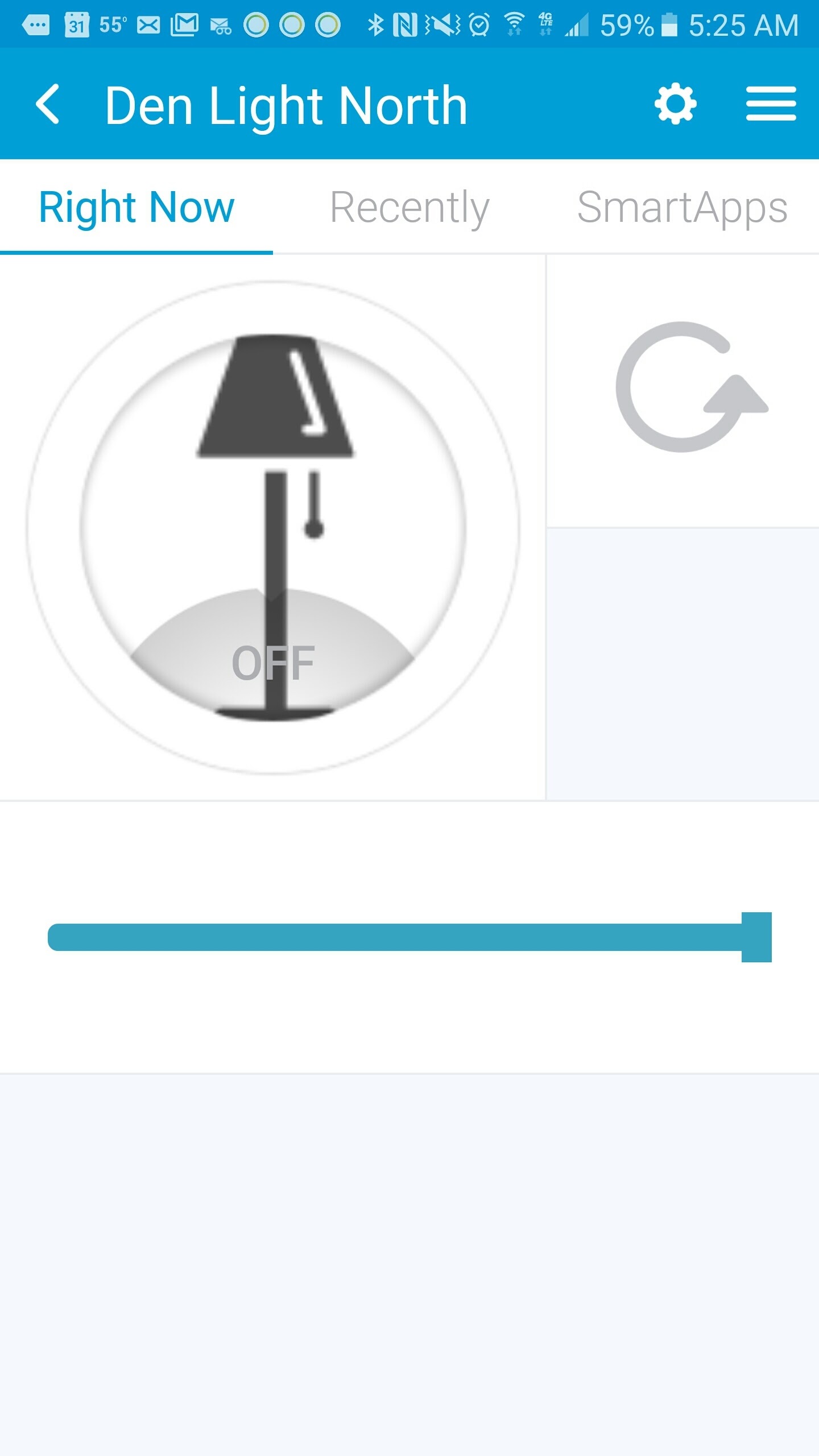
I was hoping this might get fixed on this new update but I still get inconsistent icons being displayed. I much prefer having the larger icon view. You can see two incidents of the same icon displaying in radically different sizes.
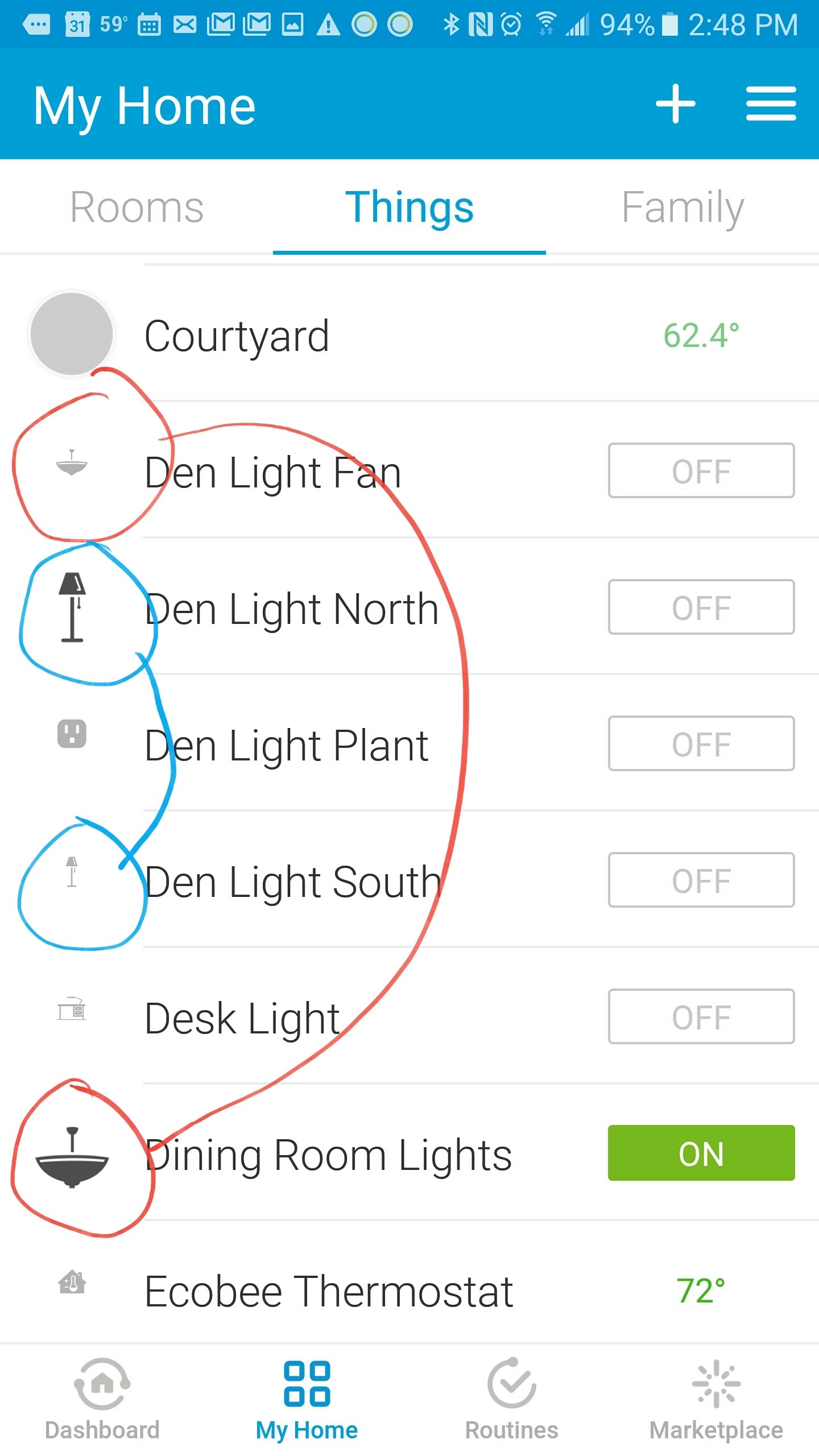
I always wondered about that. When I pick the icon from the list I saw the bigger black one. Under my things I get the tiny grey one. Hmmm. I’m even more broken than I knew. Wondering what else is broken that I just don’t realize yet?
This is in the process of being fixed so perhaps that’s why there’s an inconsistency? We have a gigantic library of images so it’s a rather complex process but when we roll it out, it’s going to significantly improve views like this.
[quote=“david.mccrindle, post:93, topic:45919”]
This is in the process of being fixed so perhaps that’s why there’s an inconsistency? We have a gigantic library of images so it’s a rather complex process but when we roll it out, it’s going to significantly improve views like this.
[/quote]Thanks a lot for the reply!
It is a minor issue after all in light of all issues really but it is good to know it is not being overlooked. I have all three app’s Windows, iOS, Android and I noticed it only exists on iOS and Android. I say this to help you identify the issue quicker. The Windows Phone app looks consistent at least but unfortunately it is with the smaller less desirable tiny gray icons. See below

I am using the exact same device handlers and changed both to the same icons in the library yet they display differently. Again my preference is the black larger icon, the gray is harder to see ESPECIALLY when it is in the Things menu. I am guessing the issue is the way SmartThings is trying to fit the icon in these screens so it doesn’t cover up the text “OFF”. The little gray one here isn’t an issue when it is on this screen because it is large enough although the gray doesn’t contrast well. With Windows app it shows small gray version of icon in this screen.
Will we be able once again to create a group of lights as we could in the V1 app?

.

While note native to the app you might want to take a look at “Trend Setter”:
Design looks good!
Since people are providing feedback, here is mine on the Android version:
My Home
One of my biggest problems with this section is the lack of a search function. It’s manageable with a few devices and rooms, however when you build up your portfolio, having to scroll through endless lists gets a bit tiresome.
Routines
Can we have the option to:
-
Put them in a list
-
Provide custom icons
-
and whilst we’re at it, allow them to be a bit more complex cough Rule Machine cough
Hamburger Menu
Why is this on the right, it just feels awkward. Android even has a slide out navigation drawer from the left as part of their standard development framework…
1 Like
Agreed. I’ve got 90+ devices and it’s a long list to navigate. Search would be an awesome addition. We’ve also been looking at categorizing devices.
Agreed that custom icons would be a great add. We’ve considered custom colors as well. We’ve looked at a list as well but it leads to a different interaction pattern compared to say a Things list as you need to run and configure. So we opted for a grid. Agreed on more complex rules too.
We’re considering moving it to the left. We agree it’s unconventional. The previous thinking was to maintain a consistent design across platforms but we’re looking at adopting platform specific convention (i.e. Material Design). The issue was iOS-related and getting a back button and menu button on the left as well as a potentially long label and contextual controls on the right. Placing it on the right gave us a better defined tap target.
On Android, it’s different because past top-level, Material Design dictates the menu button becomes a back button and a left swipe reveals the menu.
At the same time, we’re also cognizant of not making major changes again. Especially to navigation. If a lot of you guys want us to move it to the left, there’s a stronger case for us to get it into a build.
1 Like
YES… a thousand times, yes! By having it be the opposite of every other app on a user’s phone, it becomes “that oddball app” (+ it doesn’t help engender acceptance from family members that I’m trying to win over).
5 Likes
I apologize, was there an answer on voiceover navigation that I missed?
My housemate has decided he will no longer work the app for me, so unfortunately I will have to leave SmartThings shortly if the app continues to be inaccessible.
5 Likes
@david.mccrindle: As much as I would like to see the menu reversal fixed, this accessibility issue should take priority. It is more important (not to mention, a moral obligation) to at least fulfill the spirit of Section 508.
10 Likes
Agreed whole heartedly!
2 Likes
No, apologies from me. I forgot to respond. We’ve identified a task force within design and QA to ensure we’re not breaking accessibility with updates. In the next iOS release, we’ve fixed the ability to close the menu with Voiceover. Accessibility is absolutely a priority for us.
5 Likes
