This is a write up on how to make a graph showing your AC/thermostat state activity in Action Tiles that self updates. This relies on the very useful logging app that @krlaframboise wrote and is linked here --> Simple Event Logger
For the start of this, there are a few things that have to already be done;
- You will have had to already have installed the logging app and setup a Google sheet.
- You will have to already have the thermostats you wish to chart assigned to that Google sheet and have a few data points in that sheet.
- You will already have to have a Action Tiles account and a panel built.
PART 1. Taking the raw data and making a pivot table and subsequently a graph off of it.
First we have to wrangle the data into working form and then we can make the graph.
In your main google sheet, up in the tool bar click on “data” and choose “pivot table”. From there it will either make a new sheet for you or ask the data range from which to work. Change any data range to show “Sheet1!A:E” and “new sheet” and let it make its new sheet.
On the new sheet, in the window to the right you want to configure the following items;
- Rows ADD “Date/Time” and set it for descending and un-click show totals if its chosen.
- Filters ADD “Device” and choose the thermostats that you would like to include in this graph.
- Filters ADD “Date/Time” choose filter by condition, and set for how far back you want to see data.
- Filters ADD “Event Name” and from the options choose “thermostatOperatingState”.
- Columns ADD “Device” un-click show totals if its chosen.
- Columns ADD “Description” un-click show totals if its chosen.
- Values ADD “Calculated Field” in the formula box fill with “=2” and summarize by “SUM”.
You should end up with something like this;


Next Click on the top of column A to select all of it. Click on “Format” in the top toolbar, second down in that list to “number” and from the date options select how you want your dates to show. Either with time showing or not, also you can make your own custom date and time configuration. I have mine set to “month, day, hour, minute, am/pm” which will show 11/13 3:25PM.

Next we are going to go back to the pivot table editor. Click on cell A1 and the editor on the right hand side should pop up again. Right click and hit Copy of cell A1. Go to the next open column in the same sheet, leave it as a buffer and the next column from it (in the first/top row) hit Paste. What we are doing here is copying the entire pivot function as a second instance into an open area. It might take a second but you should now have 2x identical calculating fields as shown below. Make sure you hit the expand button next to each devices so that you can see the descriptions per device as shown below.

Click on the top left cell of the second pivot table to bring up the editor for the second table. The only change we are going to make here is in the values field to change the calculated field formula to “=1”
So your final tables should look similar to this

So what we have done is we have taken the device and limited the scope to whatever time frame you wish to look at. Within that we have assigned values of #2 and #1 to each action. In the graph we are going to graph positive actions out of the columns with value #2 and the idle or negative actions out of columns with value #1.
Now we get to make the graph!!
From the top toolbar click “Insert” and choose chart. More than likely it will come up with what it thinks a chart should look like. No worries we are going to edit it to our needs.
On the right hand side a “chart editor” should have also opened up. Here are the changes we are going to make;
- From “Chart Style” choose “Stepped area chart” (you might have to hover over the charts for the name to show) and select the next “stacking” option to “none”
- For the X-Axis if its already populated click edit or add “A3:A500” the second number is how many rows there are in your sheet so it might only allow you however many there currently are. If this give you an error, scroll all the way down and see how many rows you have. Use that number otherwise.
Now we are going to add the items you want to indicate when its running. For those indications we are going to use the columns with the #2 value.
- In the series, click edit or add “B3"B500”. You will see the graph populate with that action
- repeat for any other positive change actions such as heating (whatever column thats in) etc.
- By choosing to start in the 3rd row we are effectively naming the data in the graph as well. Should you have multiple devices that report the same state such as “cooling” for example you may have to start your series in the second row which will then label the device as opposed to the action on the chart. Down the road you could differentiate actions by colors to make it easier to read. If this section does not make sense yet come back to it when you are all done

- By choosing to start in the 3rd row we are effectively naming the data in the graph as well. Should you have multiple devices that report the same state such as “cooling” for example you may have to start your series in the second row which will then label the device as opposed to the action on the chart. Down the road you could differentiate actions by colors to make it easier to read. If this section does not make sense yet come back to it when you are all done
Now we are going to add the items for when its idle (or even offline, if you already have that value reported) but using the #1 value columns from the second table we copied over.
- In the series, click or add the column that corresponds to the Idle column with #1 values.
- If your system has been running fine you might not have a “offline” value showing yet. Its good to notate that in the future if your graph ever looks wrong its probably because a new value that was not in the original pivot table got reported and is throwing off your series.
Lastly, make sure that below the series entry box the following two check boxes are marked “Use row 3 as headers” that would name the data on the chart, as well as “use column A as labels” that will put the timestamps on the bottom.
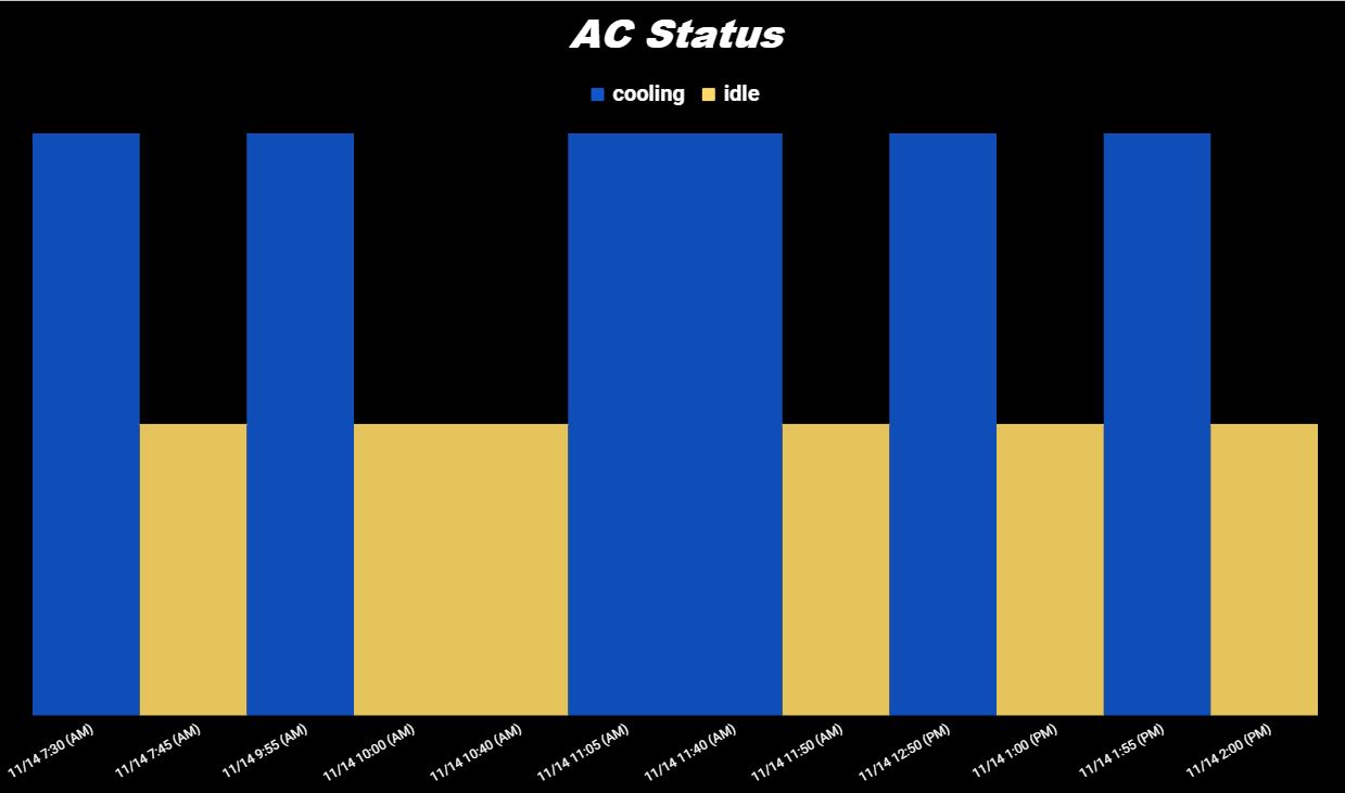
You should end up with a chart that has bars sticking up for when it was either cooling or heating and a level bar that shows when it was idle.

- In the next tab for the chart editor window you can now customize the chart to your liking in terms of color, background, grid, giving it a title, hiding the numbers, etc.
PART 2. Pubishing the graph and bringing it into Action Tiles
2x steps again.
First we need to publish the chart
-
On the chart itself, in the top right corner clock the 3x dots and select publish chart.
-
The next window is a “Publish to the web”. Under the link tab change the second box to be “Image” instead of “Interactive”.
-
Click on “Publish” a window will prompt if you are sure and click yes. You may get a security warning here or may have to sign into your gmail for whatever reason. Eitherway proceed until you get to the point where the window gives you a link as shown below.
-
Copy that entire link. You can check that it works by opening a separate tab and pasting that link. It should just open the chart itself in that tab to view. This is the live link to your chart that is now being published online. Since there is no actionable items on the chart it does not pose a security risk when shared with others but its still good to know that its an active window the world can see.


So now we have completed the publising of the chart. Now we move to ActionTiles to bring it in.
-
Log into your actiontiles
-
On the lefthand side click on “My media”
-
Bottom right, click the orange “+” ball
-
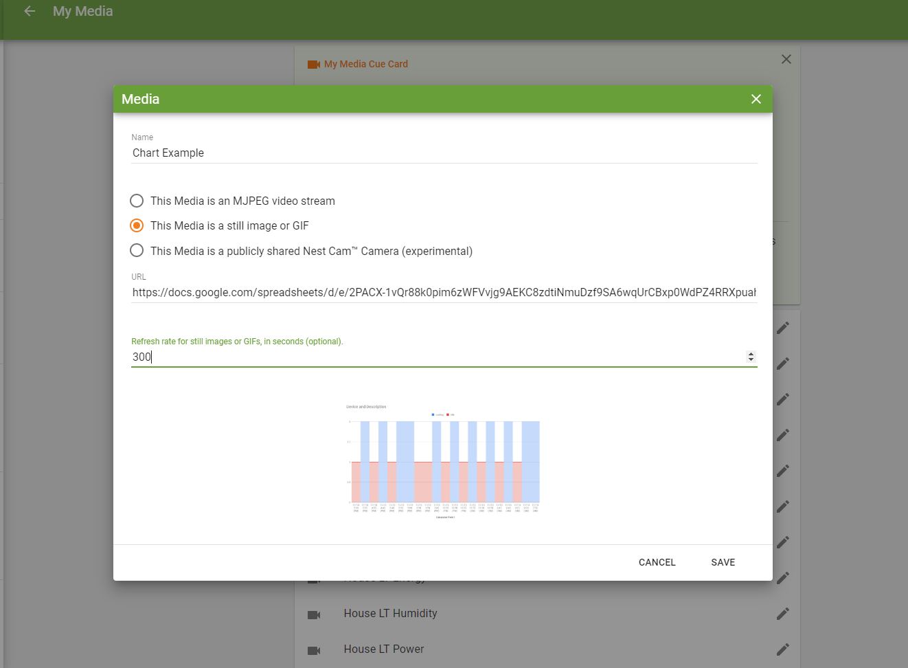
In the window that pops up, name it whatever you want to call this chart view.
-
Below the name, select the second option of “This media is a still image or GIF”
-
In the URL window paste the link you copied from the sheets publish to web window. At this point if everything worked fine it should give you the preview in the bottom of this window and you should already see your chart.
-
For me I then add a refresh rate to not bog servers and such down with constant push value. I have found that even just a every 5 minute (300 second) interval is enough to give me current enough data at a glance. Whether you do that or not, hit save to finish.
-
From there using the left hand navigation window, go to “My Panels”
-
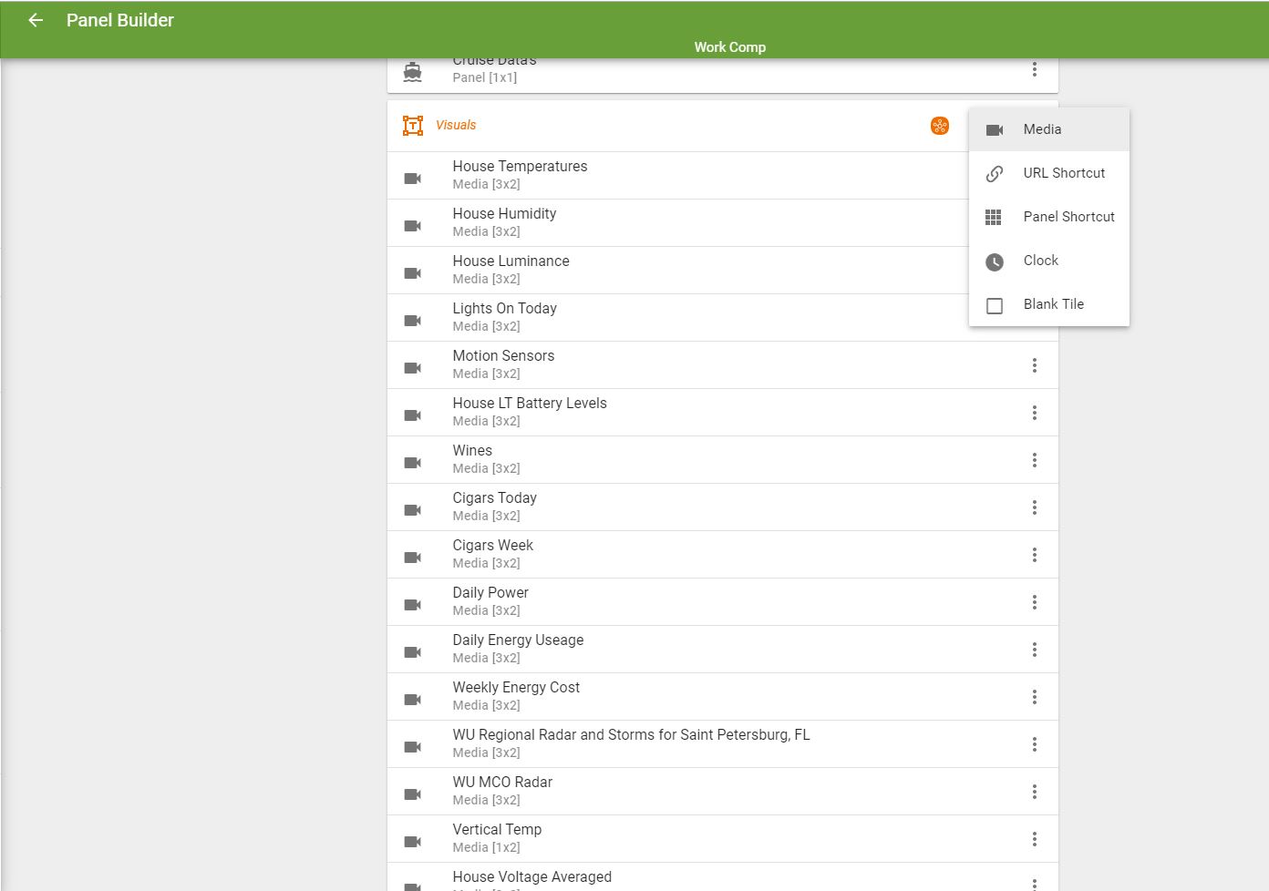
Select edit (click on the pencil) of the panel you want to add the chart to
-
If you already have a tile set built you want to put it in just click on the orange “+” block in the tile set you wish to place this chart in and click on the media option
-
From there choose the name of the media you gave your chart and click add.
-
Go back and actually view the panel you have added it to and it should be there!
And lastly here is what mine looks like once all done!