In a further update today, the channel menu now allows you to choose which controllers / locations are visible in the channel list. Handy is you have many locations to manage.

2 Likes
Just to announce the latest updates to the site…
- The Data Tables now have the option to have a total column / row which has the sum of the values in
- Smaller Data Tables now fill more available screen space
- The setting of the switch between Cost / Kwh on Kwh axes is now remembered when the graph is saved.
- We now ask for a one-off donation to upgrade to Enhanced Storage and a monthly donation to upgrade to Historical Analysis.
2 Likes
Worth every penny!
1 Like
Im emailing you for some support questions as well, but this one might be good for others to know:
Often in constantgraph i am seeing graphs that go really high, while actually those numbers are never reached.
See here for example:
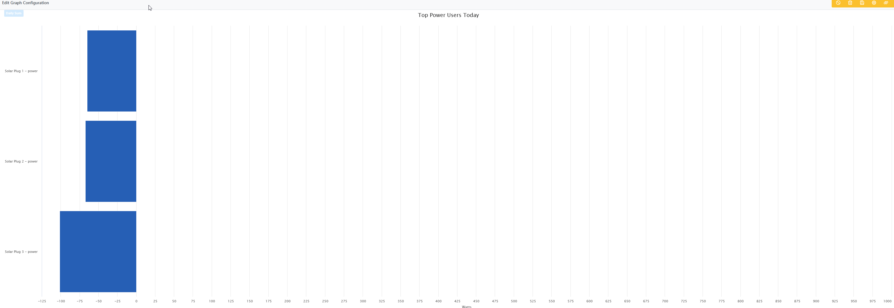
How can i make this graph fit the data that is displayed?
@goosetapo - the range of the graph is determined by the axis type and its configuration.
If you go into the Data > Channel Config menu and select any of the channels you are graphing then check the box at the bottom right where it says Power (Watts).
It will have minimum and maximum values for the axis (not to be confused with the minimum and maximum filter values higher up). If you clear the values in both boxes and save, it will make the axes automatic which is probably best for your set up.
1 Like
I deleted everything I did months ago and started over.
As you know @constantgraph I have a shelly 3em, in the past you had already looked and confirmed you can use it. Now I set it like this, keeping only channel 1 (the clamp I use, the other 2 are detached)

it’s correct?

I’ve tried reading the guides, but I really don’t understand how I can set the data correctly. For Example
What are all these channels? Where does the data come from? These channels are not associated with any particular device

Disaggregation:

I don’t know where this data comes from, I can only say that they are wrong, so somewhere I should correct but I don’t know where.
I don’t have electric stoves, so the cooking part is certainly wrong, hence I thought that perhaps these values are extrapolated from other parts, but I didn’t understand where. If I don’t understand how it works, I will hardly be able to exploit this beautiful project.
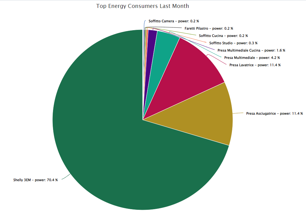
It would also be interesting to understand if the percentage usage graphs could be referred to as 100% to the energy value (in my case shelly 3EM) and not to the total of all the devices that calculate absorption and therefore consumption.
As an example I put my pie chart as an example. The percentages form 100% in total, but the total of this graph is not 100% of my consumption, but 100% of that measured by individual devices.

If in the same graph I add the shelly 3em all the values are out of phase, because in the pie graph my total consumption is calculated by also adding the shelly 3em which actually measures the total consumption of the house
Hi @Diegocampy let me see if I can help…
- Can I first check whether you have a single phase or three phase power supply to your house? It looks like you have the three phase version of the Shelly clamp and if you only have 1 clamp connected to a single phase supply, it may not work the way you expect. However, I’m not familiar with that particular model so you will need to check.
- The channels that start from 900 are automatically created when you enable Energy Disaggregation. You are correct that they are not associated with any particular smart device and have nothing to do with the other channels from your smart devices. The system analyses your energy usage and identifies which devices are being used based on the behaviour of the devices in your household even if they are not smart (you can read more about it here: Constant Graph)
- For disaggregation to work well, you need to be on the top (Historical Analysis) tier of ConstantGraph otherwise the data won’t be collected frequently enough to get accurate results.
- As for your point about the pie chart - that certainly makes sense but it’s not currently possible. I’ll have a look to see if it’s something that could be added.
1 Like
I’ve not had any raw data since 3pm is this an issue my end?
@Healy93 I haven’t seen any issues at this end and I don’t see any errors on your account - is everything alright now?
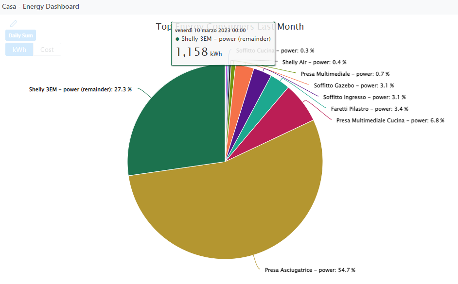
In the latest update to the site (please reload the page to get it) pie charts now detect if a channel is the from the primary device (as per the Energy > Configure menu) and deducts the values of all the other channels of the same units. This should resolve the issue mentioned by @Diegocampy above. All other graphs remain the same.
1 Like
Yes mate, think it was my browser!
Fantastic!
I don’t know if I’m wrong in some interpretation or if there is something wrong.
The two pie charts evaluate Kw and costs by selecting “DAY”
it seems strange to me, very strange, that the residual consumption (shelly 3EM) is 27% of Kw but at the same time 77% of costs. what am i missing?
KW
COST

@Diegocampy - that looks strange; it looks like you have found a bug. I have changed the way the instant data charts get updated when you click that button (which should also animate more nicely). Can you please reload the page and try again? Thanks
1 Like
I’m happy in my small way to have helped you. Now it works fine (total kwh and costs with the same % as it should be)
How do I download the historical hourly data for a > 30 day period?
I am currently on the historical analysis subscription level. I tried downloading the channel data,
but that only gives me the 30days of raw data. I’m hoping I’m just missing how to do it and this is not a feature request ![]()
Hi @georgeh - at the moment, it’s only possible to download unaggregated raw data. Can I ask what you are going to do with the data once you have downloaded it? Is there perhaps a different feature in ConstantGraph that is missing?
Sure. I have noticed some odd usage recently in one of energy meters. I wanted to do some comparison of recent trends vs those same meter readings from many months ago, with excel to do some averaging/comparison math for me. I don’t think there’s a way for ConstantGraph to show me a comparison from two different time periods on the same graph. In this particular case, things are more complicated since the older data pre-dated my use of ConstantGraphs and is captured in Grovestreams. That raw Grovestreams data I can export to a csv file.
So if I could export hourly data from CG (which must be available somewhere) or raw data older than 30 days (which I assume you do not keep) I could run my analysis. Maybe alternatively if I could import that data to CG I could do it, but there’s still the issue of comparing against two different time periods that I don’t think CG supports.
@georgeh - there is a feature that you may find useful, which is the Historical Range comparison…

Depending upon the time period selected this will show you the current data compared with the historical data. This is from the relevant help page:
The comparison menu will add an additional plot to the graph calculated from the 30th and 70th percentiles.
Percentiles are a highly useful technique for determining what the usual range of a variable is. For example to answer the question, am I using more or less electricity right now than I normally would at this time and this day of the week? The 30th percentile can be considered statistically as the low value for a data point - only 30% of the sampled data will fall below it. The 70th percentile can be considered statistically as the high value for a data point - only 30% of the sampled data will be above it. The mid value is the median where 50% of the sampled data is above the value and 50% is below. For the percentiles to give accurate results there must be enough data to sample, so if you have not been collecting data for long, the results may be variable.
- None (Raw Data) - no comparison is added
- Auto - one of the following comparisons are added depending on the date range.
- Hour - Up to 13 weeks of hourly data are examined for each matching day of the week and hour of the day. E.g. for Sunday at 7pm - all the Sundays at 7pm for the past 13 weeks will be analysed.
- Day - Up to 13 weeks of daily data are examined for each matching day of the week.
- Week - Every week is examined for the entire data set.
- Month - Every calendar month is examined for the entire data set.
Does that get you what you want…?
Alternatively you can import data into ConstantGraph using the API (on the Historical Analysis subscription). I have created a very basic example Excel file that allows you to upload data using the API here: ConstantGraphLoader.xlsm. Note that if you manually change the dates in the Excel then you can make the data appear where ever you like in the timeline! It may take a while for the data to be aggregated, depending on how much you upload and be careful only to add data in time sequence order (otherwise the data may not be aggregated).
Let me know how you get on.
I looked at the historical range comparison, and while an interesting tool unfortunately I do not think it will help answer the questions I have. I’ll attempt to explain. Also I am not sure the implications of the import and worry about corrupting my dataset - a few questions on that below.
I’d like to compare hourly average readings over a 2 month period, e.g. Dec-Jan, from this year vs prior, to see if both periods had similar increase trends over the period. For example, I’m seeing a progressively increasing increase in usage from Dec-Jan daily between the hours 7-10pm this year – was the same true for last year or is this a new thing? If I understand the historical range statistics method (assuming I had sufficient prior period data, which I do not currently), an hourly comparison will average for that hour over the entire historical period (upto 13 weeks) – so that avg number would hide any progressive change over the period itself.
As far as the data import option, I don’t understand enough to attempt using it as yet. Does it overwrite any “existing” data in the channel? I worry about mistakes that corrupt good data I have captured. Is there a way to “delete” imported data? It would be nice if I could import to a different/new channel, and then try the historical comparison between that channel and the one of interest, but I don’t think that is how the historical comparison works currently.
In trying out the historical feature, I chose the “difference from mid” option since I assumed that might be simpler to understand. The resulting graph I got is below. I thought “difference from mid” would plot the difference of the “mid point” of the historical data vs the current actual, but it the line callout text shows a range of values (e.g. “-556 - 943”), so I don’t understand what the difference from Mid represents.

So I guess at this point I’d request the option to export historical hourly data beyond the 30 day period, as a low priority feature request. (Or raw data beyond 30 days if that is actually kept.)
On an unrelated question, during trying to use the comparison I found that I must have a bad data capture point in this channel outside the 30 day period. This renders any graphs spanning that time point useless. Since it is outside the 30 day period, I cannot use the existing filter feature to remove it. Is there a way to correct that in the hourly data? (screenshot below).
